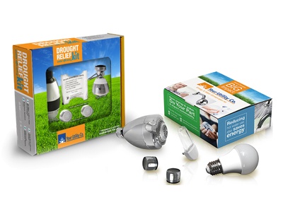
When it comes to designing successful packaging for any type of consumer product, there are a few tried-and-true rules: Use succinct, direct language; employ unique and eye-catching design; prioritize consistent and memorable branding; and clearly convey your product’s primary benefits without overburdening your target audience with excessive info.

But unlike crafting packaging for a salad dressing or multivitamin—items of which there are countless competing options for shoppers to choose from—energy efficiency kits typically stand alone. Utilities, conservation companies, and other similar organizations providing these kits have more than a couple of seconds to attract eyes. Thus, the trick becomes designing a package that’s enticing enough to pique potential users’ interest and prompt them to open the kits, examine their contents and implement them in their homes or workplaces.
Just by the nature of what you’re offering—energy- and water-conserving LED bulbs, hot water gauges, shower timers, and so on—you have a few factors working in your favor. For one, based on the popularity of personal electronics and “smart home” devices, we know that Americans are gripped by gadgets—especially products that save time and money, resolve precise problems and make life a little easier.
Also in your corner is the fact that consumers are increasingly invested in conserving energy. A recent Nielsen survey found that 71 percent of households consider energy efficiency very important. Seventy-six percent of consumers plan to take measures to make their homes more energy efficient in the next three years.
While this sentiment spans demographics, the millennial generation is particularly concerned with conservation. Our recent blog post, Engaging All Generations in Corporate Sustainability, points out, in 2015 millennials became the largest group in the workforce and value engaging in energy conservation because it is related to a good cause. This demographic also has an estimated $200 billion to $1.68 trillion in annual spending power.
A 2016 survey by Accenture found that “Millennials … are very receptive and far more likely to consider distributed energy resources products and services after receiving related information—87 percent compared to 60 percent among those over 55.’’ In other words, you have an already captive audience in a significant segment of your kit recipients.
But even gadget-loving, sustainability-focused, economically minded young consumers need to take the next step of actually investigating and then implementing the tools provided in your kits. Here are a few points to consider when designing a package that’ll inspire engagement.
Speak their language. While you’re not marketing solely to millennials, recognize that they are a large contingent of your kit recipients and probably the most apt to dig in and utilize your energy- and water-conservation tools. The bottom line for the millennial mindset is that it’s experience-driven. They want co-creation, co-participation and collaboration. They’re attracted to experiences more than things. In your messaging, clearly explain usage (perhaps linking to an installation video), give examples for how they can actively engage with these tools to improve energy efficiency and encourage them to share their experiences with their circles and on social media.
Broadcast your brand. Who are you, what do you stand for and why are you distributing this product? Be sure to accentuate your brand name so that it becomes emblazoned in consumers’ minds and comes to be what they associate with energy conservation.
Embrace minimalism. Over the past decade or so, brand logos across all industries have become cleaner, simpler, and more streamlined, using easier-to-read typography, fewer but bolder colors, fewer gimmicky design elements and more white space. Websites, apps and other interfaces have followed the same trend. The reason? Minimalism works. With fewer accoutrements and less text for consumers to sift through and process, your message comes across more quickly and clearly. Choose a few key features to highlight, focusing on their benefits versus the techy details and let those be a primary draw of your packaging.
Be transparent. It’s hard to find a bigger buzzword these days than transparency. Consumers, millennials especially, expect full disclosure from brands. Explain in real terms what your products can actually do, backed by your own or third-party testing, rather than making pie-in-the-sky claims that’ll spark skepticism.
Display your kit contents. Whether you use a cutout window to give kit recipients a sneak peek or you display an image of the tools on the back of the box, somehow give them a taste of what to expect upon opening their kits.
Include easy-to-follow instructions. Maybe you follow IKEA’s successful model of mapping out assembly instructions all in pictures, or perhaps you spell out the how-to’s in prose. Whichever route you choose, don’t leave users wondering how to implement or maintain your products. Explain everything clearly without making the instructions unnecessarily complex.
Provide contact info. Be sure to include a phone number, website, app, or social media page somewhere on the exterior of you kit or in the instructions within. Communicate clearly that you want to ensure the best possible user experience, and should any comments, concerns, questions or suggestions arise, you’ll be more than happy to hear them.
AM Conservation Group offers a variety of kit programs to support your program goals. These include custom packaging.


